How to make a kinetic typography: 1.Choose a writing or poem that you like 2.Then you make your piece of writing/poem into a typography here are 5 tips to help:
Choose a good font
Text Size
The text contrast
Character and line spacing
then text colour
3.The last part was go to power point and add the animations like
The green one is for the entrance where it starts.
The yellow one is for the emphasis and its like the main attraction.
The red one is for the exit where you end the animation.
And the last one the white is for the motion paths for more animation.
And you do the same thing all the words, but don't hesitate putting more than one animation, its better if you put more.
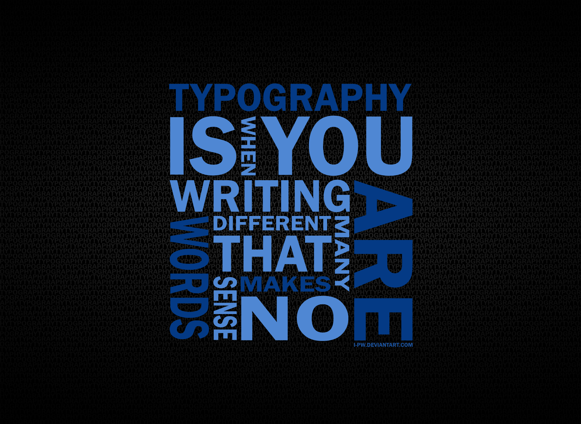
These videos are two examples of kinetic typography. Kinetic typography is a way of making a presentation more interesting by animating the word and pictures. To do kinetic typography you need to chose your font, text size, text colour,character and line spacing, text contrast, and finally you have to think CREATIVELY!!!
How to make a Kinetic Typography: 1. Pick a type of writing that you like. 2. Then make the piece of writing in to typography remember the 5 helpful tips.
Choice of Font
Text size
Text Contrast
Character and line spacing
Text colour
3. Now this is where it gets fun and complicated, this is when you make that piece of writing that you picked, move by addend animation.
go to power point
dotypography in power point
then you click on the icon that says animations on the tool box
then you click on the blue star
when you have clicked what you have chosen find an animation that fits the word
This my butterfly animation i really like this project because it was the first animation that i work on there was lots of challenges for me because the animations on power point got me confused the easiest part was doing the the actual butterfly itself .
This my Kinetic Typography I think this is the most confusing thing i have ever done because the animation drives me nuts because I had 30 or 20 animations on this one video it took me a long time to do it my favorite thing was watching the animation and having to look at it and i can say ''I made this'' i really fun with this project i hoped I ca do it again.
2.) Make the poem that you have chosen into a beautiful typography.
keep in mind the 5 tips for better typography:
Choice of font
Textsize
Text contrast
Character and line spacing
Textcolor
3.) Now you can make your poem more exiting by add animation. You can do this by going on the the animation panel and clicking any animation the best suits the word or sentence you are looking for. Plus if you click the the icon that says More Animation and right at the bottom their are 4 stars that can give you more options when you click it.
Tip:
Green star is an animation for more entrance effects.
Yellow star is an animation for more emphasis effects.
Red star is an animation for more exit effects.
White star is for more motion paths that lets you words move.
My Butterfly video above... My Butterfly video wasn't really that creative, I am no Artist, but I do like Animating, though this is the first time I've animated on a Microsoft Application. So you've already expected Boring stuff.
After the maybe... below is next.
My Typography Poems above... I had been confused on what to do in this assignment apparently, and I it seemed like a hard thing to do, but I got used to it after seeing others, that are better than mine, so I just kept on going to what I had been doing, the Animations included may seem boring although.
These videos are examples of kinetic typography. In order to do this you would need to follow the typography rules. Also having Microsoft PowerPoint would help you preform kinetic typography. You just need to add size to your text and animations to get you in to typography. Pictures are the same thing too. That is how you would do kinetic typography.
These were my first animations using PowerPoint. We've been requested to write 50 to 100 words on how to create a Kinetic Typography on PowerPoint. Although I am very much inexperienced, I will attempt to do just that while going into as little detail as I can.
If one would like to attempt a Kinetic typography as I have, one must first open PowerPoint, of course. Once you're in the program, under the heading 'INSERT', you can insert a text customize your text until you feel it is relevant to the words you're using. But how to actually animate it? Under the heading 'animations', there are many animations to choose from. Entering animations, exiting animations, special animations, and motion paths. To keep track of the animations you're using, open an animation pane. Now you can choose animations, and edit their timing, and what order they come in.
Now that I've explained this to the very extent which my abilities will allow me to, I will gladly finish this post.
Unless you have updated to the latest and greatest version of PowerPoint, you may be wondering: "Holy crabs, the 2010 version of PowerPoint can't do all this stuff," and
that you'd like to update that old version into a hip, new, cooler
version (and the new layout is minimalistic and doesn't hurt the "I am a
professional designer" part of my brain). Thus, I am one of the many
people on this blog who'll help you get started once you've updated
PowerPoint, or would like to partake in the art of kinetic typography. Enough of me rambling, though; let us "enter a new era" of Powerpoint.
(tl;dr = acronym for "too long; didn't read"; for those whom don't have time for many words)
I would assume making the butterfly animation was a test run for us, and kind of an introduction to animation within the application. I'd suggest if you are a beginner in kinetic typography, try making a butterfly first of all; just to get the gist of all the animation options, and how to use the animation pane. Personally, I was pretty excited when our teacher brought up the idea of making something move in Powerpoint (an app I only thought was for school presentations and business matters). If you want to make a pretty butterfly, figuring what to do next can be fairly confusing if you don't know how to properly control the animation pane (the sidebar thing that shows you every animation you inserted into your slide), because you have to put all the animations in order and if it isn't that way, then you're going to have an awkward butterfly. Other than that, I'm certain the video is self explanatory as to how simple making an animation in PowerPoint is. Have some patience with it, and you'll be as good as Leonardo Da Vinci if he was tech-savvy and living in the 21st Century. tl;dr: Making a butterfly in PowerPoint is a little difficult to do when you don't know how to work the animation pane, so I'd suggest you read some tutorials and watch YouTube videos on the basics of animation. Nonetheless, making a moving butterfly in PowerPoint is simple.
After you have mastered the art of the butterfly (not the dance move) and animating with powerpoint, now it is time to create actual kinetic typography. Firstly, in this case, select a poem that really catches your eye and makes your heart skip a beat, respectively. This poem has to speak to you and cause you to exaggerate–like me, right now. Secondly, open PowerPoint (duh!) and you might want to copy and paste your poem onto a blank slide, and before you try to make anything look sexy and spicy, you might want to add in some more blank slides and break your poem up into separate stanzas like I've done. Unless you don't dig that kind of style, then do it your way. It's a free country. Thirdly, figure out your fonts and colour scheme! This might be the most tedious part, but font and colour really do make typography what it is. Feel free to evolve those fonts like Pokèmon and bold! Italicize! Bold and italicize! As long as you don't go wild, try it out and make your words stand out with the right colour scheme, size and font. Last but not least, after you've suffered countless hours trying to pick which font to download, now you can animate. There's a secret to making kinetic typography be worth watching; you should think of your poem in context. While animating, the key words should come alive and actually act like the word, you feel me? Perhaps, like if you were animating the word 'snake', you should make it look like it's slithering.
Otherwise, that's all I really have to say about kinetic typography. I enjoyed making this project a lot and I hope I explained things clearly. tl;dr: Step 1: pick a poem. Step 2: divide up your stanzas on PowerPoint slides. Step 3: choose colour scheme and fonts that look good with each other and apply those to the poem, also arranging the words where you want them. Step 4: animate and take note of keywords, making them come "alive".
I am away filming with the Grade 9's today. Here are your assignments.
1. Have your butterfly and Poems published as a video from powerpoint. Have them uploaded to youtube and embedded at your blog. Most of you had this done last class.
3. In Google Drive or Power Point make one of these songs typographic or kinetic. Time limit 1 week. Bonus Marks. Add it to your kinetic typography post. This is the link http://www.songsforteaching.com/christmas/
This is my Butterfly Movie, it took us 10 classes maybe 8 including the Kinetic Typography about Shel Silverstein, well this butterfly, is pretty hard at first, but when I finished it, I feel like doing more videos about, kinetic, we did this in power-point, which has animations, but I think there's more sites to go to, to do this kinetic typography, this is really fun, but frustrating at first but I enjoyed it, and learned a lot of things, about kinetic typography, probably I'll make more of this stuff, at home, to practice, and make wonderful kinetic typography
Shel Silverstein Poem Kinetic Typography
This one is about the kinetic Typography, about Shel Silverstein, It was fun, without any pictures, to work on, just animations, but when your doing this your words, should relate, by what is your font, and what your sentence is, if the sentence says I may twirl, tip, or disappear, as I was embarrassed, your font should be felling that it is embarrassed, and the animations will, be twirling, tipping, disappear, then come back and fell embarrassed, like fade animation. It is really fun to do it, because in this assignment, we're not allowed to use pictures, but words that is relating to the quote.
This is my Butterfly Movie, this is my first time making this kind of animation it was really cool when we first started making this because in PowerPoint we got all this cool animations like making it turn, go sideways and many more. We first started making this and it was really really hard but when we got to the point where we add animations it started to be exciting and fun. I would love to make more awesome video.
This is my Kinetic Typography it is really fun because I already know how to add animations. It was really fun to play around. Its not that hard to make this kind of stuff especially when you already know how to put some cool animations like circle for snowball and you can do many stuff.
How you create kinetic typography
like the ones above is you have to have Power Point, and then go to animations.
After that you have to click on animation panel so you can see what animations, and when it appears you put in your slides. Then you have to take a shape or text and put
animations you want by clicking if there is no good ones you can click on the
more motion paths, more entrance effects, more emphasis effects, and more
exit effects. When you pick the animation you like, you can put more animations
to your shape or text, or you can put animations to other shape or text. Also
you should not put it all one slide because that would get a little messy, what
you have to is try to put your or text on your new slide where the slide left
it, and then put animations. You should try to keep it smooth, but I know how
hard it is to do that, so just try your best.
I do not expect good marks on this assignment because it was confusing for me, word choice was hard because I did not know how to make the certain words pop out. Animation choice was also hard because I didn't know the proper animations for the proper words.
This is my butter fly animation, the time it took me to make this was about 10 classes give or take 1 or 2, along with the kinetic typography assignment. This was a fairly easy assignment, didn't have any problems with this assignment at all. But without proper guidance it can get pretty confusing to figure out what to do next. all in all i had fun doing this. Anyways i hope you enjoyed watching the video.
Moving on to my kinetic typography, the point of this assignment was to make new slides for some shel silverstein quotes, but in typography form. This assignment is very similar to the "playing with fonts" assignment back in September. This was also fairly easy, the only problem i had was choosing which animations will go with which sentence, paragraph or even word, because there are so many animations to choose from in Microsoft power point. Other than that i enjoyed doing this assignment, and i hope you'll enjoy watching. Bye!
To make a kinetic typography in Power Point, you firstly need PowerPoint, which is kind of obvious. The next step is to open PowerPoint. Third you type whatever you need to type, then select it. After select the text box which you want to animate and go to the animations tab at the top of Power Point. Add Animation and select the animation you want and voila, done. Just a tip to help you a lot, open the animation pane to keep track of which animations you have and when it appears.
To make a power point animation likes these. You will need power point of course, I believe it doesn't matter on the year of power point. To start get a word of shape, and click on it. Once you click on it. Once you have done that go to the animation button on the top of the screen and pick an animation. There is different types of animations that you can pick. Such as how you want your word or shape to enter or leave. To see the animation and play it click on animation pane. Here you will see all of your animations that you have made on the slide that you are on. Hope this helps you create your own animations.
This is my Butterfly movie, I really enjoyed making the Butterfly movie, but it is pretty complicated to make.
To make the butterfly movie first we made a circle, with that circle we made it move to the center we made a stick shape like the letter Y, then we cut the circle in half. We then made the circle turn 180 degrees clockwise. Now the butterfly is almost finish, now we need to make the butterfly move, all we need to do is pick any animation for the butterfly.
This is my Kinetic Typography, This was also fun and easy to make.
First I copy the first line, then I picked a font, you can also pick a color if you want.
Now I Pick an animation for my line I then moved to my next line I did the same thing.
Now to make your typography better, you can also relate your line to any animation, for example: If your line says "spin" you can make your line spin or if your line says "blue" you can make that word blue.
Here are the instructions for your Kinetic Typography Assignment
First you have to have both your butterfly animation and poem animation at your Youtube channel.
Your post should have the following
Title #$%^&'s Kinetic Typography
Labels your name, Kinetic Typography
In the body you need to have the following A picture that is about you poems Butterfly Movie Poem Movie
Your poem has to have the following
Title Slide This will have the name of the poet and the poem. The next slide will be the poem through kinetic typography Last slide is the entire poem on one slide. Following the animations you need to write between 50 and 100 words on how to make a kinetic typography in Powerpoint.
You will also be marked on the quality of your animations. Are they helping explain the text better.
If you want bonus marks you need to do a second animation.
Here is your next assignment. Read the PowerPoint presentation. Please chose two poems from this website and use one slide for each to make powerful Typography.
Our first assignment is on internet safety, we are going to review two videos.
This first video makes me feel upset that someone would even have the courage to go up in front of so many people and say rude things about another. Even if it is a metaphor, it still makes me sad.
Our first assignment is on Internet Safety. We are going to review a video.
This video makes me feel genuinely sorry for people who think it's okay for them to insult someone else over the internet but when it comes to reality, they're too cowardly and afraid. You've heard this saying many times; "If you wouldn't say it in front of their face, then why would you say it online?", and this video explains just that but in a surreal way. Everyone knows that a majority of the human population wouldn't have the heart (or the guts) to stand in front of an audience and bully an individual because all chaos breaks loose when that happens but for some odd reason, we somewhat still invalidate cyber-bullying because "You don't know if they meant it", "But they're so friendly to you in person", and "What if that's not them?" All forms of bullying should be taken seriously no matter what, and I just think it's sad that some types of bullying are treated as if they're more important when they're not.
A second video that campaigns for anti-bullying is...
All right, so I learnt something I never knew before and I thought it was pretty neat considering I enjoy closely observing typography for an incredibly unnecessary amount of time on tumblr. And I've always thought about what kind of black magic the typographer used on their work to make it so visually appealing to all eyes.
But just recently, a majestic video unlocked the wonders and the holy secrets of typography to me and opened my small key-lime-sized brain and it evolved into an apricot-sized one (and as to why I'm referencing my tech/math teacher on a blog post about "the artistry of creating art with words–and no, I'm not talking about literature" goes beyond me.
This is the part where I've realized I rambled so much and everything gets awkward.
Oh, boy.
Alright. I should just get on with it–
HELLO, WELCOME, I AM HERE TO TELL YOU THAT THERE ARE MAGICAL FIVE COMPONENTS THAT MAKE TYPOGRAPHY EXTREMELY AESTHETICALLY PLEASING AND I DON'T KNOW WHY I'M YELLING; THIS IS NOT IN ANY WAY NECESSARY!!!!11!!!1!
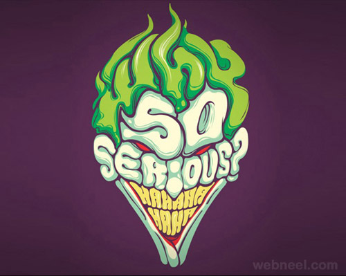
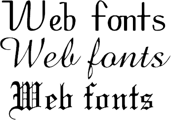
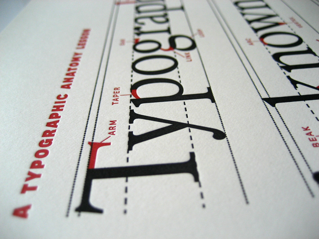
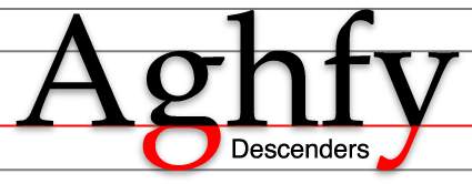
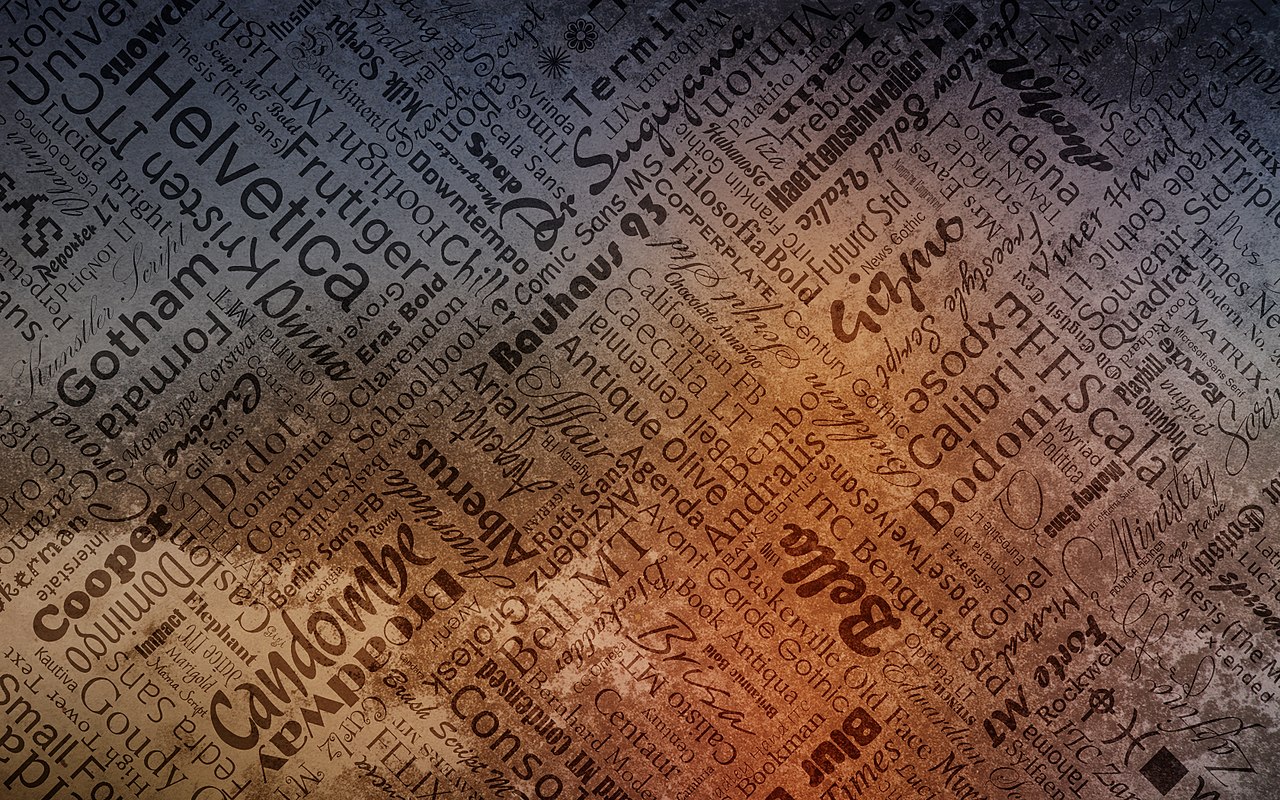
Font: First things first, if you're the type of person who thinks comic sans and dingbats are in any way socially acceptable should really reevaluate their font choices and stare at some typography tip videos. I like to think of font as the backbone of typography. Nothing too flashy or cringe-worthy like those old gothic styled fonts that make you go "k but does that say, 'pacific' or 'pacifier'?", and nothing that's as bland and boring as Arial or Calibri. Y'know; those classic Microsoft Office fonts that are soooooooo boooooringgggg? If you want font inspiration, look at minimalist typography (mm, so simple yet so good)! You'll notice how mainly, only one or two fonts are used, and it doesn't look busy. Less is more! Unless when it comes to money.
What are the 5 types of typography:
The five types are fonts, size contrast, line spacing, and color, this are the 5 types of typography and I'm going to tell you all about them.
Fonts- ( making the fonts wonderful by choosing beautiful fonts)
size- ( your making your font size to small or to big)
contrast- ( making your presentation to look wonderful or such)
Line spacing- (making your fonts by having space beside them or tighter to them)
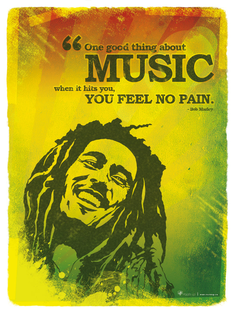
color- ( making your fonts colorful but, you need to pick 2-3 colors, or more, because if it has more colors, it will make it messy and bad) This is my Awesome Shel Silverstein Poem


_speeds_across_the_water_near_USS_Ogden_(LPD_5),_off_the_coast_of_Kodiak_Island,_Alaska.jpg)


