https://c2.staticflickr.com/6/5081/5361356575_6f74bd7caa_b.jpg
All right, so I learnt something I never knew before and I thought it was pretty neat considering I enjoy closely observing typography for an incredibly unnecessary amount of time on tumblr. And I've always thought about what kind of black magic the typographer used on their work to make it so visually appealing to all eyes.
But just recently, a majestic video unlocked the wonders and the holy secrets of typography to me and opened my small key-lime-sized brain and it evolved into an apricot-sized one (and as to why I'm referencing my tech/math teacher on a blog post about "the artistry of creating art with words–and no, I'm not talking about literature" goes beyond me.
This is the part where I've realized I rambled so much and everything gets awkward.
Oh, boy.
Alright. I should just get on with it–
HELLO, WELCOME, I AM HERE TO TELL YOU THAT THERE ARE MAGICAL FIVE COMPONENTS THAT MAKE TYPOGRAPHY EXTREMELY AESTHETICALLY PLEASING AND I DON'T KNOW WHY I'M YELLING; THIS IS NOT IN ANY WAY NECESSARY!!!!11!!!1!
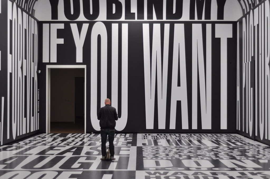
Font: First things first, if you're the type of person who thinks comic sans and dingbats are in any way socially acceptable should really reevaluate their font choices and stare at some typography tip videos. I like to think of font as the backbone of typography. Nothing too flashy or cringe-worthy like those old gothic styled fonts that make you go "k but does that say, 'pacific' or 'pacifier'?", and nothing that's as bland and boring as Arial or Calibri. Y'know; those classic Microsoft Office fonts that are soooooooo boooooringgggg? If you want font inspiration, look at minimalist typography (mm, so simple yet so good)! You'll notice how mainly, only one or two fonts are used, and it doesn't look busy. Less is more! Unless when it comes to money.
Size:


This is cool
ReplyDeleteUNderneath my Outside fAce is my Under fACE
ReplyDelete